Parking Availability Prototype
Created an intuitive and user centric parking availability prototype using Figma
to improve parking availability at Wayne State University.
I developed a parking availability prototype using Figma to enhance the experience of searching for parking on the Wayne State Parking Website. The primary challenge was ensuring users could efficiently check the availability of parking structures and lots on Wayne State’s campus. The existing interface was a simple webpage displaying a list of parking structures labeled as either open or full. It also indicated which structures permitted access via a WSU permit, OneCard, or visitor credit card.
The overall goal of my project was to improve this interface, making parking availability information more accessible and user-friendly. While users could check parking availability via phone or the website, navigating the site and quickly finding relevant information required unnecessary effort. This was especially problematic while driving, as it posed a safety concern.
I chose this task based on my own experiences as a commuter, as well as frequent complaints from friends and classmates regarding parking difficulties on campus. Too often, I arrived at a parking structure only to find it full, leading to wasted time searching for an alternative. To address these issues, I followed an iterative design cycle, continuously refining the prototype to enhance efficiency and usability.
My approach focused on incorporating intuitive design elements, and improved mobile accessibility. By streamlining the process, the new interface aimed to reduce frustration and improve the overall parking experience for Wayne State students, faculty, and visitors. Through careful analysis, design, implementation, and evaluation, I successfully developed a more user-friendly and reliable parking availability system that contributes to a smoother, less stressful parking experience for the campus community.
Final Prototype Design
Based on my need-finding, brainstorming, and evaluation insights, I have created a medium-fidelity prototype. The design alternatives that are implemented in the prototype include parking preferences (permit type, proximity, cost, special parking types), real-time notifications, interactive maps, a color-coding schema that indicates special parking (EV stations and handicaps), and predictive analysis like popular time graphs. Overall, this prototype satisfies all of the design alternatives that I chose.
Prototype Features Explained
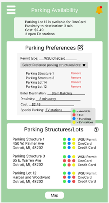
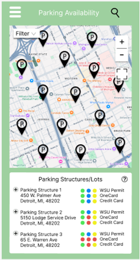
As you can see in the first image, the prototype includes more detailed and enhanced design alternatives of the real-time notifications, parking preferences, and the color-coded schema in the parking Structures/Lots list. The real-time notifications show a description stating that parking lot 12 is available for OneCard, the proximity to the destination is 3 min away, the cost is $2.49, and there are three open EV stations. This detailed notification is tailored to the user's parking preferences. The real-time notifications with detailed descriptions ensure users have the most relevant and up-to-date information. This design alternative mirrors the challenges users face with locating available parking efficiently.
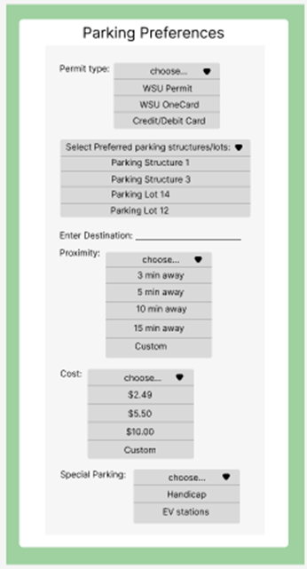
The parking preferences display the user permit type, preferred parking structure/lot, as well as preferred cost, proximity, and special parking. The user is able to change these preferences by clicking the edit icon next to the parking preferences title. A more detailed figure of this functionality will be shown in the appendices. The user can also remove a parking structure/lot from preferences by clicking remove. This parking preferences feature reflects a deep understanding of user-specific needs, such as proximity, permit type, and cost. Allowing users to customize their preferences made this prototype more adaptable to varied use cases and enhanced user satisfaction.
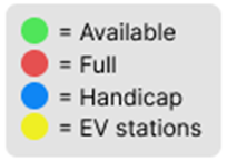
The parking structure/lots section shows a list of parking structures located around campus. Next to it is the color-coded schema indicating green for available, red for full, blue for handicapped, and yellow for EV stations. Each of these dots is next to the preferred parking types, such as WSU Permit, OneCard, and credit card. The parking structure/list also has a question mark icon circle in the top left corner, which explains the color-coding schema and, which is shown in the appendices. The map button at the bottom of the screen takes the user to the interactive map page. Overall, these color-coded indicators for handicap, and EV stations provide quick, intuitive understanding of parking statuses. This visual aid aligns with user expectations for clear, accessible information and reduces cognitive load.
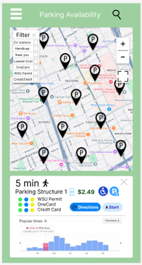
The second image shows the interactive map, where users can drag the screen to look for parking structures and landmarks that they are near. This helps them get a better idea of where the parking structure is located. The parking icons scattered on the map indicate the parking structure/lot location. The user is able to filter their search by selecting an option in the filters tab. For instance, if the user selects handicap, then only handicapped parking structures/lots will be displayed. There are plus and minus buttons to zoom in and out, and there is also a full-screen button on the right side of the map.
The image also shows the list of parking structures just like in the first image, except If the user clicks on either the icons in the map or the plus sign button, it then will display a new section shown in the third image, which includes the travel time, cost, color-coded schema, and popular times graph that shows the peak times. In this section, the user can also click the directions button or the start button to begin the route to the chosen parking structure/lot. Essentially, the interactive map emulates the familiar functionality of Google Maps, reducing the learning curve for users. The ability to visually locate parking structures and access detailed information directly from the map also addresses the common challenge of special awareness on large campuses. By integrating the popular time graphs, the prototype anticipates user needs for predictive planning. This design alternative is especially useful for users looking to avoid high traffic, which reflects a proactive design.
Additional Detailed Prototype Features
A. Detailed image of parking preferences editor to modify parking preferences.
B. Explanation of icon meanings that will pop up when the user clicks the question mark button.